Spreads & packages
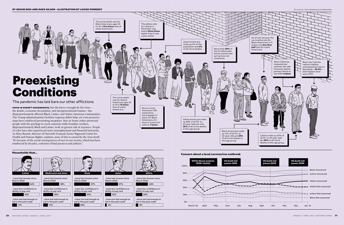
Preexisting ConditionsHow the pandemic unmasked America’s other afflictions. cowritten with edwin rios • illustratons by louise pomeroy • design by adam vieyra
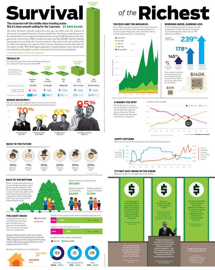
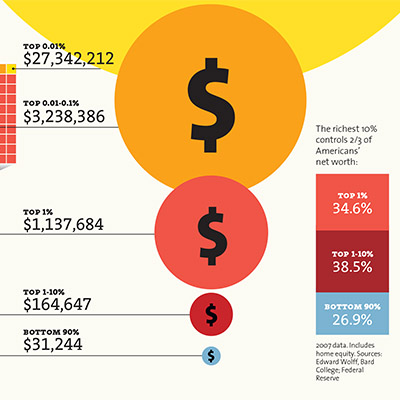
Survival of the RichestHow the great recession made income inequality worse. art by mattias mackler • design by carolyn perot
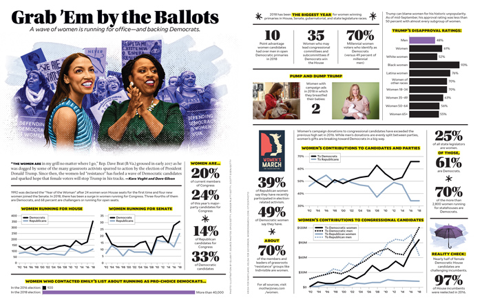
Grab ’Em by the BallotsA statistical preview of the 2018 election and the congressional “pink wave.”
cowritten with kara voight • design by adam vieyra
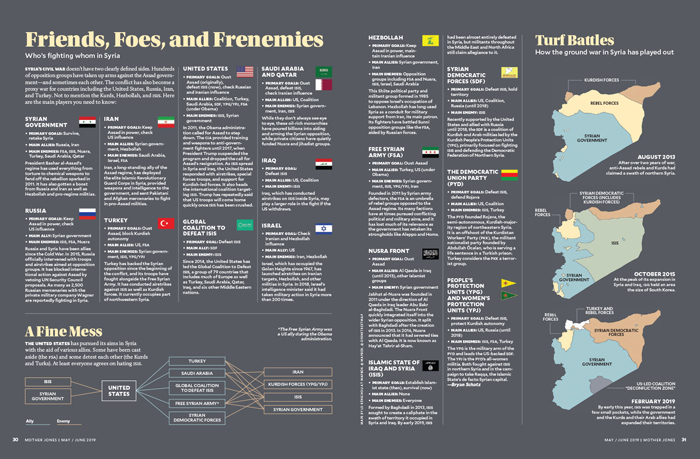
Behind the LinesSidebars and maps accompanying a feature on the American role in the Syrian civil war.
article by shane bauer • sidebar by bryan schatz • design by carolyn perot and adam vieyra • maps by lo benichou
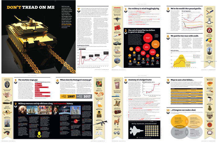
Don’t Tread on MeA cover package on where the Pentagon’s $600 billion-plus budget goes.design by carolyn perot • opening illustration by gluekit
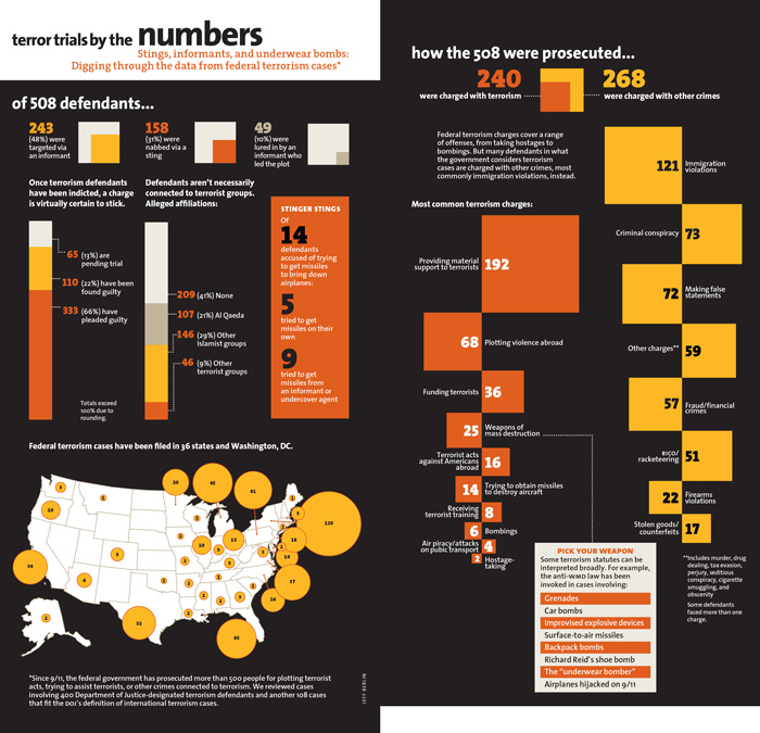
Terrorists for the FBIAnalyzing and visualzing a database of more than 500 federal terrorism cases. Part of an investigation into post-9/11 terrorism stings that won a Data Journalism Award. data collected by trevor aaronson • design by carolyn perot
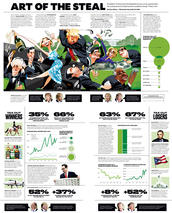
Art of the StealAuditing the Trump tax cut. illustration by andré carrilho • design by adam veiyra
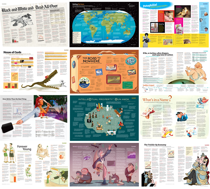
ExhibitBetween 2005 and 2010, I wrote, researched and/or edited nearly 20 Exhibits, two-page spreads of stats, charts, and trivia about a wide range of topics, including credit card debt, virtual worlds, signs of climate change, intellectual property battles, the decline of print, and babies’ environmental footprint. concept by clara jeffery • illustrated by multiple illustrators • design by multiple designers
America’s trickle-up economyillustrations by jason schneider • design by carolyn perot
Donald Trump’s original Cabinet, by the numbers design by adam vieyra
How taxpayers subsidize the oil industrycowritten with andy kroll, benjy hansen-bundy, and alex park • design by carolyn perot
Charts & data viz
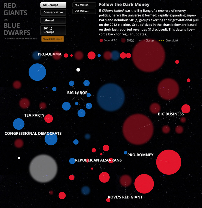
Planet MoneyAn interactive, live-updated map of the dark-money universe of the 2012 election.coedited with tasneem raja • with reporting by gavin aronsen • coding by ben breedlove and aj fox
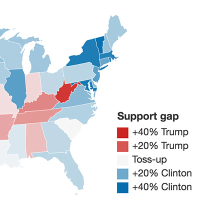
Exploring the role of demographics in 2016
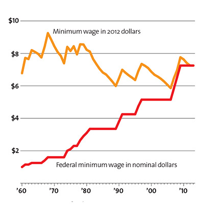
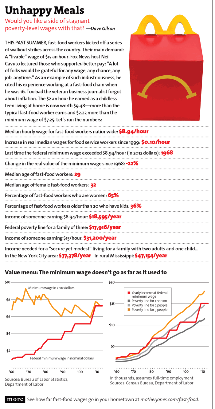
Why fast-food workers deserve a break (or raise) today.
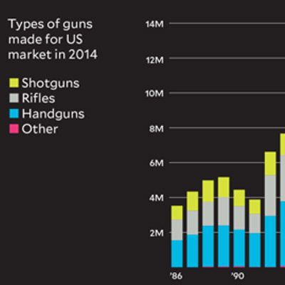
The shadowy world of America’s biggest gun makersstory by josh harkinson
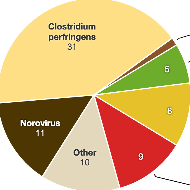
How often do burritos make Americans sick?

What’s really in your phone?
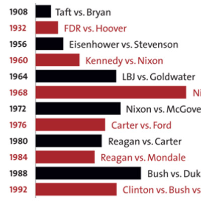
More than 140 years of election spending
Random & humorous
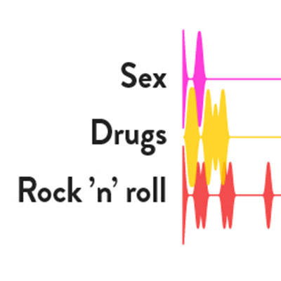
Why the last 2 years have felt like 2,448.
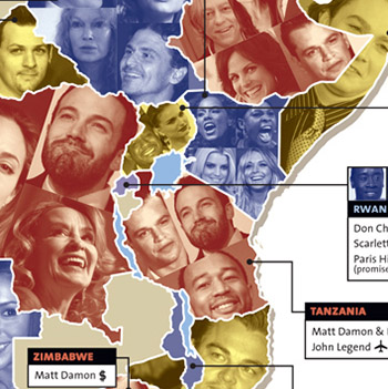
Mapping the celebrity colonization of Africa
Charting Keith Richards’ Life
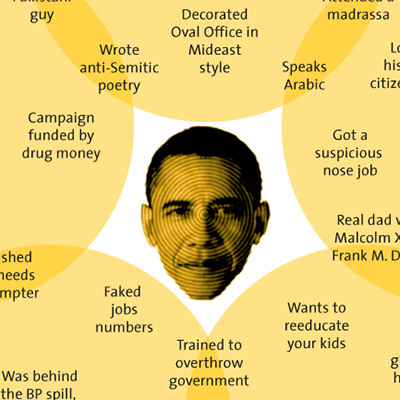
Almost every Obama conspiracy theory ever.
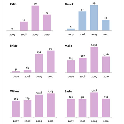
When people name their babies after politicians.
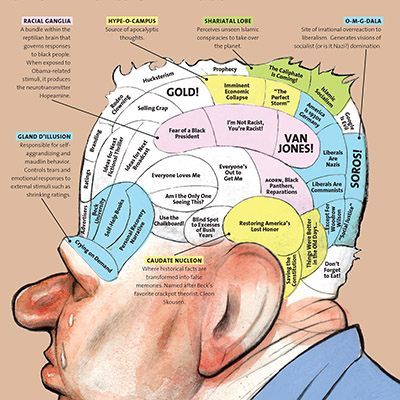
The phrenology of Glenn Beck